



Context
shadcn/ui를 활용해 Sidebar 컴포넌트를 구현하게 되었다. Sidebar 컴포넌트를 다운로드 받은 후 살펴보니 내용이 매우 많고 한 눈에 이해하기에 한계가 있었다. 따라서, 로컬에 있는 코드를 살펴보면서 내용을 정리 해보기 위해 이 글을 작성하게 되었다.
Agenda
•
shadcn/ui의 Sidebar 컴포넌트와 부가 요소를 살펴보고 코드를 분석 및 이해
Contents
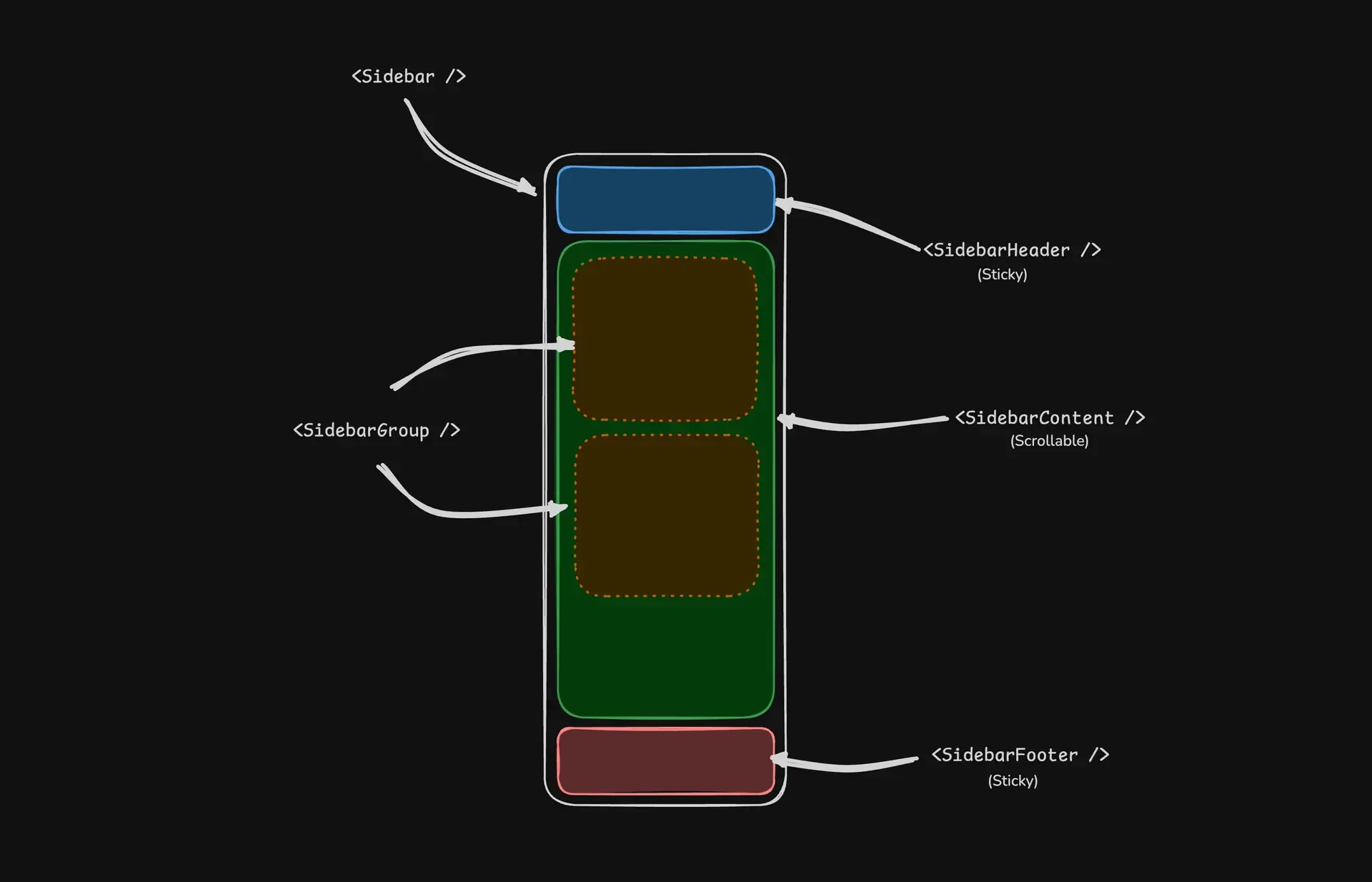
위는 shadcn/ui에서 제공하는 Sidebar 컴포넌트의 구조이다.
아래의 명령어를 통해 Sidebar 컴포넌트를 다운로드하니, 여러 파일이 레포지토리에 다운로드 되었다.
$ pnpm dlx shadcn@latest add sidebar
Shell
복사
다운로드 된 파일은 여러개로 Sidebar 컴포넌트에서 사용 되는 컴포넌트와 부수적으로 사용할 수 있는 컴포넌트들이었다.
공식 문서에서 알려준 방법대로 아래의 파일을 구성한다.
•
app-sidebar.tsx
import {
Sidebar,
SidebarContent,
SidebarFooter,
SidebarGroup,
SidebarHeader,
} from "@/components/ui/sidebar"
const AppSidebar = () => {
return (
<Sidebar>
<SidebarHeader />
<SidebarContent>
<SidebarGroup />
<SidebarGroup />
</SidebarContent>
<SidebarFooter />
</Sidebar>
);
};
export default AppSidebar;
JavaScript
복사
•
layout.tsx
import { Outlet } from 'react-router-dom';
import AppSidebar from '@/components/app-sidebar';
import { SidebarProvider, SidebarTrigger } from '@/ui/components/sidebar';
const DevLayout = () => {
return (
<SidebarProvider>
<AppSidebar />
<SidebarTrigger />
<Outlet />
</SidebarProvider>
);
};
export default DevLayout;
Shell
복사
layout.tsx는 router를 통해 하위 페이지를 표현할 예정이라 <Outlet />을 사용했다.
컨텐츠를 표시하는 Layout은 SidebarProvider로부터 Outlet까지의 depth를 이루고 있다. Sidebar 컴포넌트 파일은 약 700줄에 달하는 매우 긴 파일인데, SidebarProvider가 사이드바의 상태, 모바일 분기, 토글 등을 모두 결정하는 컨트롤 타워 역할을 하고 있는 것 같아 SidebarProvider부터 살펴보기로 했다.
SidebarProvider
SidebarProvider의 실행문 첫 줄 부터 아래의 부분이 눈에 띈다.
const isMobile = useIsMobile();
const [openMobile, setOpenMobile] = React.useState(false);
JavaScript
복사
개인적으로 웹 프로젝트를 진행하면서 가장 까다롭고 어려운 부분이 Mobile 분기 및 대응이라고 생각하는데, shadcn은 useIsMobile 훅을 통해 모바일 분기를 처리했다.
import { useEffect, useState } from 'react';
const MOBILE_BREAKPOINT = 768;
export const useIsMobile = () => {
const [isMobile, setIsMobile] = useState<boolean | undefined>(undefined);
useEffect(() => {
const mql = window.matchMedia(`(max-width: ${MOBILE_BREAKPOINT - 1}px)`);
const onChange = () => {
setIsMobile(window.innerWidth < MOBILE_BREAKPOINT);
};
mql.addEventListener('change', onChange);
setIsMobile(window.innerWidth < MOBILE_BREAKPOINT);
return () => mql.removeEventListener('change', onChange);
}, []);
return !!isMobile;
};
JavaScript
복사
내용은 위와 같다. 기존 코드는 export function useIsMobile()로 선언되어있지만, arrow function을 사용하는 방향이 마음에 들어 수정하였다. 앞으로의 코드 또한 arrow function을 사용한다.
const MOBILE_BREAKPOINT = 768;
JavaScript
복사
이 훅은 768이라는 값을 통해 모바일 분기점을 잡는다. 너비 768 미만은 모바일, 너비 768 이상은 데스크탑으로 모바일화면인지 아닌지를 구분한다.
const [isMobile, setIsMobile] = useState<boolean | undefined>(undefined);
JavaScript
복사
isMobile은 상태 값을 저장하는 변수로, 초기 값은 undefined로 지정 되어있다. 화면이 렌더링 되기 전에는 모바일화면인지 아닌지 판단할 수 없기 때문에 undefined로 지정 되어있다.
useEffect(() => {
const mql = window.matchMedia(`(max-width: ${MOBILE_BREAKPOINT - 1}px)`);
const onChange = () => {
setIsMobile(window.innerWidth < MOBILE_BREAKPOINT);
};
mql.addEventListener('change', onChange);
setIsMobile(window.innerWidth < MOBILE_BREAKPOINT);
return () => mql.removeEventListener('change', onChange);
}, []);
JavaScript
복사
useEffect훅으로 화면의 렌더링이 완료된 후 실행된다.
const mql = window.matchMedia(`(max-width: ${MOBILE_BREAKPOINT - 1}px)`);
JavaScript
복사
window 전역 객체의 matchMedia API를 사용하여 현재 화면의 너비가 최대 767px 이하의 조건을 만족하는지 안하는지 판단한다. mql은 Media Query List의 약자로 768 미만의 조건을 가진 matchMedia 객체를 갖는다.
const onChange = () => {
setIsMobile(window.innerWidth < MOBILE_BREAKPOINT);
};
mql.addEventListener('change', onChange);
JavaScript
복사
onChange 함수는 isMobile 상태 값을 현재 너비가 분기점보다 작으면 true 값으로, 같거나 크면 false 값으로 지정한다. 이 onChange 함수는 mql 객체의 change 이벤트에 등록 된다.
setIsMobile(window.innerWidth < MOBILE_BREAKPOINT);
JavaScript
복사
이 실행문은 화면이 처음 렌더링이 완료된 후 실행되는 구문이다. 처음 isMobile 값은 undefined 값으로 모바일인지 아닌지 판단할 수 없다. 따라서 최초 화면 렌더링 후 현재 화면 너비와 분기값의 크기를 비교하여 값을 할당한다.
return () => mql.removeEventListener('change', onChange);
JavaScript
복사
cleanup 함수로 컴포넌트가 언마운트 되거나 useEffect가 다시 실행되기 직전에 실행 된다. 메모리 누수와 중복 실행을 막기 위해 작성 되었다.
return !!isMobile;
JavaScript
복사
중요한 부분으로 현재 Mobile 화면인지 아닌지 판단하는 상태 값을 반환한다.
다시 Sidebar 컴포넌트의 SidebarProvider로 돌아와서,
// This is the internal state of the sidebar.
// We use openProp and setOpenProp for control from outside the component.
const [_open, _setOpen] = React.useState(defaultOpen);
const open = openProp ?? _open;
const setOpen = React.useCallback(
(value: boolean | ((value: boolean) => boolean)) => {
const openState = typeof value === 'function' ? value(open) : value;
if (setOpenProp) {
setOpenProp(openState);
} else {
_setOpen(openState);
}
// This sets the cookie to keep the sidebar state.
document.cookie = `${SIDEBAR_COOKIE_NAME}=${openState}; path=/; max-age=${SIDEBAR_COOKIE_MAX_AGE}`;
},
[setOpenProp, open],
);
JavaScript
복사
위의 코드는 Sidebar의 열림/닫힘 상태를 관리하는 부분이다. SidebarProvider는 외부에서 Sidebar의 열림 닫힘의 최초 상태를 결정지을 수 있고 컨트롤 또한 가능하게끔 설계 되어있다.
•
defaultOpen은 SidebarProvider의 파라미터로 기본 열림/닫힘 상태를 지정할 수 있다.
◦
true면 열림, false면 닫힘 상태이다.
•
openProp은 SidebarProvider의 파라미터로 Sidebar의 열림/닫힘 상태를 지정하는 값이다. openProp은 open의 aslias인데, defaultOpen 값이 설정 되어있어도 openProp 값이 파라미터로 주어지면 openProp 값을 따라간다.
•
setOpen은 Sidebar의 내부 열림/닫힘 상태를 관리하는 함수이다. useCallback 파라미터로 boolean | (value: boolean) => boolean 두 타입의 파라미터를 허용하는데 이는 setOpen(true), setOpen(false), setOpen(prev => !prev) 와 같은 형태 모두 지원하기 위함인 것으로 추측한다. 외부에서 파라미터로 지정한 setOpenProp 함수가 있으면 그 함수를 사용, 없으면 내부에 있는 setter를 사용한다.
•
신기한 부분은 Cookie를 사용하여 열림/닫힘 상태를 저장하는 것인데, 아마 SSR을 위해 작성해둔 것 아닐까 생각한다. Next.js와 같은 프레임워크를 사용하여 SSR을 사용하지 않을거라면 local-storage에 저장해도 상관 없을 것으로 예상한다.
아래는 변경한 코드.
...
const SIDEBAR_STORAGE_NAME = 'sidebar_state';
...
// Internal state of the sidebar.
// Use openProp and setOpenProp for control from outside the component.
const [_open, _setOpen] = useState(defaultOpen);
const open = openProp ?? _open;
// Enable setOpen(true/false) and setOpen(prev => !prev) patterns.
const setOpen = useCallback(
(value: boolean | ((value: boolean) => boolean)) => {
const openState = typeof value === 'function' ? value(open) : value;
if (setOpenProp) {
setOpenProp(openState);
} else {
_setOpen(openState);
}
// Save sidebar state in localStorage for persistence.
localStorage.setItem(SIDEBAR_STORAGE_NAME, String(openState));
},
[setOpenProp, open],
);
JavaScript
복사
아래의 코드는 Sidebar의 열림/닫힘 상태를 조작하는 코드이다.
// Helper to toggle the sidebar.
const toggleSidebar = React.useCallback(() => {
return isMobile ? setOpenMobile((open) => !open) : setOpen((open) => !open);
}, [isMobile, setOpen, setOpenMobile]);
// Adds a keyboard shortcut to toggle the sidebar.
React.useEffect(() => {
const handleKeyDown = (event: KeyboardEvent) => {
if (event.key === SIDEBAR_KEYBOARD_SHORTCUT && (event.metaKey || event.ctrlKey)) {
event.preventDefault();
toggleSidebar();
}
};
window.addEventListener('keydown', handleKeyDown);
return () => window.removeEventListener('keydown', handleKeyDown);
}, [toggleSidebar]);
JavaScript
복사
// Helper to toggle the sidebar.
const toggleSidebar = React.useCallback(() => {
return isMobile ? setOpenMobile((open) => !open) : setOpen((open) => !open);
}, [isMobile, setOpen, setOpenMobile]);
JavaScript
복사
toggleSidebar 함수는 Mobile 환경이면 setOpenMobile을 사용하여, 데스크탑 환경이면 setOpen을 사용하여 Sidebar의 열림/닫힘 상태를 지정한다. useCallback 함수로, 함수를 매번 새로 생성하지 않고 의존성 배열 안에 있는 항목들이 변경 되었을 경우에 다시 함수를 그려낸다.
...
const SIDEBAR_KEYBOARD_SHORTCUT = 'b';
...
// Adds a keyboard shortcut to toggle the sidebar.
React.useEffect(() => {
const handleKeyDown = (event: KeyboardEvent) => {
if (event.key === SIDEBAR_KEYBOARD_SHORTCUT && (event.metaKey || event.ctrlKey)) {
event.preventDefault();
toggleSidebar();
}
};
window.addEventListener('keydown', handleKeyDown);
return () => window.removeEventListener('keydown', handleKeyDown);
}, [toggleSidebar]);
JavaScript
복사
이 hook은 단축키를 사용하여 사이드바를 열고 닫을 수 있게 설정하는 부분이다. 컨트롤 + SIDEBAR_KEYBOARD_SHORTCUT을 누르면 Sidebar의 열림/닫힘 상태가 전환된다.
// We add a state so that we can do data-state="expanded" or "collapsed".
// This makes it easier to style the sidebar with Tailwind classes.
const state = open ? 'expanded' : 'collapsed';
JavaScript
복사
boolean 타입인 open 값에 따라서 state가 expanded 또는 collapsed로 설정 된다. HTML Element를 살펴보면 Sidebar에 data-state="expanded” 형식으로 속성이 설정 되어있는 것을 볼 수 있다. 이를 통해 Tailwind에서 아래와 같이 쉽게 스타일링을 진행할 수 있다.
className="data-[state=collapsed]:w-14 data-[state=expanded]:w-64"
JavaScript
복사
const contextValue = React.useMemo<SidebarContextProps>(
() => ({
state,
open,
setOpen,
isMobile,
openMobile,
setOpenMobile,
toggleSidebar,
}),
[state, open, setOpen, isMobile, openMobile, setOpenMobile, toggleSidebar],
);
JavaScript
복사
Context에 넘겨줄 공용 상태 묶음을 만드는 코드이다. 이를 통해 Context를 쓰는 컴포넌트는 아래와 같이 Provider에서 넘겨주는 값을 사용할 수 있다.
const {
state,
open,
setOpen,
isMobile,
openMobile,
toggleSidebar,
} = useSidebar();
JavaScript
복사
아래는 현재까지 변환 된 코드.
// Toggle function for sidebar.
// If mobile, toggle mobile sidebar state.
// If not mobile, toggle desktop sidebar state.
const toggleSidebar = useCallback(() => {
return isMobile ? setOpenMobile((open) => !open) : setOpen((open) => !open);
}, [isMobile, setOpenMobile, setOpen]);
useEffect(() => {
const handleKeyDown = (event: KeyboardEvent) => {
if (event.key === SIDEBAR_KEYBOARD_SHORTCUT && (event.ctrlKey || event.metaKey)) {
event.preventDefault();
toggleSidebar();
}
};
// Add event listener for keyboard shortcut.
window.addEventListener('keydown', handleKeyDown);
// Cleanup event listener on unmount or when toggleSidebar changes.
return () => window.removeEventListener('keydown', handleKeyDown);
}, [toggleSidebar]);
// Add a state so that we can do data-state="expanded" or "collapsed".
// This makes it easier to style the sidebar with Tailwind classes.
const state = open ? 'expanded' : 'collapsed';
const contextValue = useMemo<SidebarContextProps>(
() => ({
state,
open,
setOpen,
isMobile,
openMobile,
setOpenMobile,
toggleSidebar,
}),
[state, open, setOpen, isMobile, openMobile, setOpenMobile, toggleSidebar],
);
JavaScript
복사
<SidebarContext.Provider value={contextValue}>
<TooltipProvider delayDuration={0}>
<div
data-slot='sidebar-wrapper'
style={
{
'--sidebar-width': SIDEBAR_WIDTH,
'--sidebar-width-icon': SIDEBAR_WIDTH_ICON,
...style,
} as React.CSSProperties
}
className={cn(
'group/sidebar-wrapper has-data-[variant=inset]:bg-sidebar flex min-h-svh w-full',
className,
)}
{...props}
>
{children}
</div>
</TooltipProvider>
</SidebarContext.Provider>
JavaScript
복사
Sidebar 전체 레이아웃과 전역 툴팁 설정, 컨텍스트 공급을 한 번에 감싸는 구조이다. SidebarProvider의 마지막 부분이다. SidebarContext.Provider는 Sidebar 관련 상태/함수를 하위 컴포넌트들이 사용할 수 있게 한다. 이 Provider 안에 있는 모든 children은 Sidebar의 상태를 공유하게 된다.
<div
data-slot='sidebar-wrapper'
style={
{
'--sidebar-width': SIDEBAR_WIDTH,
'--sidebar-width-icon': SIDEBAR_WIDTH_ICON,
...style,
} as React.CSSProperties
}
className={cn(
'group/sidebar-wrapper has-data-[variant=inset]:bg-sidebar flex min-h-svh w-full',
className,
)}
{...props}
>
{children}
</div>
JavaScript
복사
위 코드는 사이드바를 포함한 레이아웃을 감싸는 wrapper이다. data-slot은 위에서 말해왔던것처럼 컴포넌트 식별용이다.
style={
{
'--sidebar-width': SIDEBAR_WIDTH,
'--sidebar-width-icon': SIDEBAR_WIDTH_ICON,
...style,
} as React.CSSProperties
}
JavaScript
복사
개인적으로 신경쓰였던 부분은 이 코드이다. 컨벤션에서 인라인스타일은 쓰지 않기로 했는데, style 속성이 등장하여 --sidebar-width와 --sidebar-width-icon을 할당한다. 따라서 data-* 식별자를 활용해 mobile인지 desktop 화면인지 구분하여 css 파일에서 해당 값을 변경하는 방식으로 수정하였다.
<SidebarContext.Provider value={contextValue}>
<TooltipProvider delayDuration={0}>
<div
data-slot='sidebar-wrapper'
data-screen-type={isMobile ? 'mobile' : 'desktop'}
className={cn(
'group/sidebar-wrapper has-data-[variant=inset]:bg-sidebar flex min-h-svh w-full ',
className,
)}
{...props}
>
{children}
</div>
</TooltipProvider>
</SidebarContext.Provider>
JavaScript
복사
/* desktop */
[data-slot="sidebar-wrapper"][data-screen-type="desktop"] {
--sidebar-width: 16rem;
--sidebar-width-icon: 3rem;
}
/* mobile */
[data-slot="sidebar-wrapper"][data-screen-type="mobile"] {
--sidebar-width: 18rem;
--sidebar-width-icon: 3rem;
}
CSS
복사
Sidebar
화면에 보여지는 Sidebar 컴포넌트이다.
function Sidebar({
side = 'left',
variant = 'sidebar',
collapsible = 'offcanvas',
className,
children,
...props
}: React.ComponentProps<'div'> & {
side?: 'left' | 'right';
variant?: 'sidebar' | 'floating' | 'inset';
collapsible?: 'offcanvas' | 'icon' | 'none';
}) {
...
}
JavaScript
복사
위의 코드는 Sidebar 컴포넌트가 받을 수 있는 파라미터와 그 타입이다. side 파라미터는 Sidebar가 위치할 곳을 지정하며, left 또는 right로 설정할 수 있다. variant는 Sidebar가 보이는 형태인데 sidebar는 배경색이 있으면서 완전히 영역 위, 아래, 옆면이 붙어있다. floating으로 설정하면 padding이 있는 것처럼 나타나며 inset은 배경색이 없어지고 경계 또한 사라져보인다. collapsible 파라미터는 offcanvas, icon, none 세 가지 값을 받을 수 있다. offcanvas는 사이드바를 접고 펼칠 수 있으며 접었을 때 완전히 접혀서 사이드바가 보이지 않는다. icon으로 설정시 접고 펼칠 수 있고 접었을 때 아이콘 영역이 보인다. none으로 설정시 접을 수 없다.
const { isMobile, state, openMobile, setOpenMobile } = useSidebar();
if (collapsible === 'none') {
return (
<div
data-slot='sidebar'
className={cn(
'bg-sidebar text-sidebar-foreground flex h-full w-(--sidebar-width) flex-col',
className,
)}
{...props}
>
{children}
</div>
);
}
JavaScript
복사
먼저, useSidebar 훅을 통해 SidebarProvider에서 제공하는 값을 사용할 수 있다. 그리고 sidebar의 collapsible 파라미터가 none일 때, sidebar는 접을 수 없다. 따라서 분기문을 통해 고정 너비의 공간을 만들어 컨텐츠를 표시한다.
if (isMobile) {
return (
<Sheet open={openMobile} onOpenChange={setOpenMobile} {...props}>
<SheetContent
data-sidebar='sidebar'
data-slot='sidebar'
data-mobile='true'
className='bg-sidebar text-sidebar-foreground w-(--sidebar-width) p-0 [&>button]:hidden'
style={
{
'--sidebar-width': SIDEBAR_WIDTH_MOBILE,
} as React.CSSProperties
}
side={side}
>
<SheetHeader className='sr-only'>
<SheetTitle>Sidebar</SheetTitle>
<SheetDescription>Displays the mobile sidebar.</SheetDescription>
</SheetHeader>
<div className='flex h-full w-full flex-col'>{children}</div>
</SheetContent>
</Sheet>
);
}
JavaScript
복사
Mobile일 화면일 때 렌더링 되는 사이드바이다. radix-ui의 wrapper 성격의 컴포넌트를 사용하여 Mobile 사이드바를 분기로 처리해 화면에 렌더링 한다. 태그 안에 style 태그를 사용하는 것이 싫어서 아래와 같이 수정하였다.
if (isMobile) {
return (
<Sheet open={openMobile} onOpenChange={setOpenMobile} {...props}>
<SheetContent
data-sidebar='sidebar'
data-slot='sidebar'
data-mobile='true'
className='bg-sidebar text-sidebar-foreground w-(--sidebar-width) p-0 [&>button]:hidden'
side={side}
>
<SheetHeader className='sr-only'>
<SheetTitle>Sidebar</SheetTitle>
<SheetDescription>Displays the mobile sidebar.</SheetDescription>
</SheetHeader>
<div className='flex h-full w-full flex-col'>{children}</div>
</SheetContent>
</Sheet>
);
}
JavaScript
복사
CSS 파일에 mobile 대상을 하나 더 추가했다. [data-slot="sidebar"][data-mobile="true"] 이 부분인데, Mobile일 때 Sheet의 Portal을 사용하여 구조적으로 외부에 렌더링 되기 때문에 --sidebar-width가 적용 되지 않아서이다.
/* desktop */
[data-slot="sidebar-wrapper"][data-screen-type="desktop"] {
--sidebar-width: 16rem;
--sidebar-width-icon: 3rem;
}
/* mobile */
[data-slot="sidebar-wrapper"][data-screen-type="mobile"],
[data-slot="sidebar"][data-mobile="true"] {
--sidebar-width: 18rem;
--sidebar-width-icon: 3rem;
}
CSS
복사
<div
className='group peer text-sidebar-foreground hidden md:block'
data-state={state}
data-collapsible={state === 'collapsed' ? collapsible : ''}
data-variant={variant}
data-side={side}
data-slot='sidebar'
>
...
</div>
JavaScript
복사
Desktop 환경에서 렌더링 되는 사이드바 컴포넌트의 시작 부분이다. className을 통해 사이드바의 스타일을 지정하고 있다. group은 자식 요소가 group-* 방식으로 부모의 data-* 값을 읽어 스타일링을 할 수 있게 한다. peer는 group과 비슷하게 형제 컴포넌트가 peer-* 방식으로 이 div의 data-* 값을 읽어 스타일링을 할 수 있게 한다. hidden md:block은 모바일에서는 숨기고 md 사이즈 이상일 때에 화면에 표시되게 한다.
{/* This is what handles the sidebar gap on desktop */}
<div
data-slot='sidebar-gap'
className={cn(
'relative w-(--sidebar-width) bg-transparent transition-[width] duration-200 ease-linear',
'group-data-[collapsible=offcanvas]:w-0',
'group-data-[side=right]:rotate-180',
variant === 'floating' || variant === 'inset'
? 'group-data-[collapsible=icon]:w-[calc(var(--sidebar-width-icon)+(--spacing(4)))]'
: 'group-data-[collapsible=icon]:w-(--sidebar-width-icon)',
)}
/>
JavaScript
복사
위 코드는 Sidebar가 차지하는 공간을 지정하는 코드이다. Sidebar는 Gap 레이어와 실제 컨텐츠를 담는 컨테이너 레이어를 분리해서 사용한다. 과거 사이드바를 구현했을 때 sidebar wrapper에 직접 width를 주어 sidebar가 펼쳐지고 접힐 때의 애니메이션을 처리 했었는데, shadcn/ui는 Gap 레이어를 별도로 두어 컨텐츠 영역을 확보 한다는 점이 신기하다. 다음에 자력으로 구현 할 때 써먹어보고싶은 스킬이다.
transition-[width]는 width 값이 변경될 때 그 변화를 애니메이션으로 처리하라는 값이다. group-data-[collapsible=offcanvas]:w-0은 부모 요소의 data-collapsible 값이 offcanvas면 width를 0으로 설정한다. group-data-[side=right]:rotate-180은 부모 요소의 data-side 값이 right일 때 rotate-180을 적용한다. variant 값이 floating이거나 inset일 때 data-collapsible이 icon일 경우 주어진 너비에서 spacing을 추가한다. 만약에 variant 값이 이 외의 값일 경우 spacing을 추가하지 않는다.
{/* Sidebar content */}
<div
data-slot='sidebar-container'
className={cn(
'fixed inset-y-0 z-10 hidden h-svh w-(--sidebar-width) transition-[left,right,width] duration-200 ease-linear md:flex',
side === 'left'
? 'left-0 group-data-[collapsible=offcanvas]:left-[calc(var(--sidebar-width)*-1)]'
: 'right-0 group-data-[collapsible=offcanvas]:right-[calc(var(--sidebar-width)*-1)]',
// Adjust the padding for floating and inset variants.
variant === 'floating' || variant === 'inset'
? 'p-2 group-data-[collapsible=icon]:w-[calc(var(--sidebar-width-icon)+(--spacing(4))+2px)]'
: 'group-data-[collapsible=icon]:w-(--sidebar-width-icon) group-data-[side=left]:border-r group-data-[side=right]:border-l',
className,
)}
{...props}
>
...
</div>
JavaScript
복사
Sidebar 공간을 확보하기 위해 Gap 레이어가 있었다면 위의 코드는 실제 사이드바가 렌더링 되는 컨테이너 부분이다. 사이드바가 렌더링 되는 위치와 variant에 따라 조건부 스타일링이 적용되어 있다. 특이한 부분은 variant의 조건이 만족할 때 +2px를 하는 부분인데, 아마 아래의 sidebar-inner에서 border 때문에 1px * 2 해서 2px만큼의 너비를 더 부여하는 것 같다.
<div
data-sidebar='sidebar'
data-slot='sidebar-inner'
className={cn(
'bg-sidebar flex h-full w-full flex-col',
'group-data-[variant=floating]:border-sidebar-border group-data-[variant=floating]:rounded-lg group-data-[variant=floating]:border group-data-[variant=floating]:shadow-sm',
)}
>
{children}
</div>
JavaScript
복사
Sidebar 컨텐츠를 렌더링하는 코드이다. 마찬가지로 variant의 조건이 만족할 경우 조건부 스타일링을 적용한다.
SidebarTrigger
const SidebarTrigger = ({
className,
onClick,
...props
}: React.ComponentProps<typeof Button>) => {
const { toggleSidebar } = useSidebar();
return (
<Button
data-sidebar='trigger'
data-slot='sidebar-trigger'
variant='ghost'
size='icon'
className={cn('size-7', className)}
onClick={(event) => {
onClick?.(event);
toggleSidebar();
}}
{...props}
>
<PanelLeftIcon />
<span className='sr-only'>Toggle Sidebar</span>
</Button>
);
};
TypeScript
복사
Sidebar를 열고 닫을 수 있는 Trigger 컴포넌트이다. shadcn/ui의 Button을 가져와서 활용한다.
SidebarRail
const SidebarRail = ({
className,
...props
}: React.ComponentProps<'button'>) => {
const { toggleSidebar } = useSidebar();
return (
<button
data-sidebar='rail'
data-slot='sidebar-rail'
aria-label='Toggle Sidebar'
tabIndex={-1}
onClick={toggleSidebar}
title='Toggle Sidebar'
className={cn(
'absolute inset-y-0 z-20 hidden w-4 -translate-x-1/2 transition-all ease-linear hover:after:bg-sidebar-border',
'group-data-[side=left]:-right-4 group-data-[side=right]:left-0 after:absolute after:inset-y-0 after:left-1/2 after:w-[2px] sm:flex',
'in-data-[side=left]:cursor-w-resize in-data-[side=right]:cursor-e-resize',
'[[data-side=left][data-state=collapsed]_&]:cursor-e-resize [[data-side=right][data-state=collapsed]_&]:cursor-w-resize',
'hover:group-data-[collapsible=offcanvas]:bg-sidebar group-data-[collapsible=offcanvas]:translate-x-0 group-data-[collapsible=offcanvas]:after:left-full',
'[[data-side=left][data-collapsible=offcanvas]_&]:-right-2',
'[[data-side=right][data-collapsible=offcanvas]_&]:-left-2',
className,
)}
{...props}
/>
);
};
TypeScript
복사
SliderRail은 Trigger처럼 작동하는 Slider border에 붙어있는 컴포넌트이다. 마우스를 올리면 세로선이 테두리에 생기는 컴포넌트로 생각하면 된다. 마찬가지로 useSidebar 훅을 활용하여 Sidebar의 펼침 상태를 토글한다. tabIndex를 -1로 주어 키보드를 사용하여 이동하거나 포커스를 줄 때 포커스가 잡히지 않도록 지정했다. data-slot이 있으면 aria-label이 필요 없다고 생각했는데, 찾아보니 aria-label은 접근성 차원에서 필요한 것이고 data-* 형태는 커스터마이징 속성이어서 다른 성격을 띈다.
제일 복잡한 부분은 스타일링 부분인데, 사이드바를 펼쳤을 때와 접었을 때 SidebarRail이 보이는 영역의 너비를 계산하느라 좀 애먹었다. 스타일링이 복잡하게 되어있으나, 하나하나 파악해나가면 이해를 할 수 있다. 추가로 group-data-*꼴과 in-data-*꼴의 접근자가 있는데, 찾아보니 둘의 기능은 유사하지만 group과 달리 in은 부모 요소에 group 값이 없어도 group처럼 사용할 수 있다. 참고 자료
SidebarInset
function SidebarInset({ className, ...props }: React.ComponentProps<'main'>) {
return (
<main
data-slot='sidebar-inset'
className={cn(
'bg-background relative flex w-full flex-1 flex-col',
'md:peer-data-[variant=inset]:m-2 md:peer-data-[variant=inset]:ml-0 md:peer-data-[variant=inset]:rounded-xl md:peer-data-[variant=inset]:shadow-sm md:peer-data-[variant=inset]:peer-data-[state=collapsed]:ml-2',
className,
)}
{...props}
/>
);
}
TypeScript
복사
Sidebar의 variant가 inset일 경우 사이드바의 배경이 없어지고 플랫한 형태가 된다. SidebarInset은 사이드바 우측에 메인 컨텐츠를 표시할 때 사용하는 Wrapper의 역할을 수행한다. variant가 inset일 경우에만 사용할 수 있는 것은 아닌 것 같은데, 스타일링에 peer-data-[variant=inset] 형태가 대부분인 것을 보아 inset 상태에서 주로 사용하는 것으로 보인다.
SidebarInput
function SidebarInput({
className,
...props
}: React.ComponentProps<typeof Input>) {
return (
<Input
data-slot='sidebar-input'
data-sidebar='input'
className={cn('bg-background h-8 w-full shadow-none', className)}
{...props}
/>
);
}
TypeScript
복사
Sidebar에서 사용하는 Input 컴포넌트이다. shadcn/ui의 Input 컴포넌트를 활용하여 Sidebar에서 사용하는 Input을 재스타일링 했다.
SidebarHeader
function SidebarHeader({ className, ...props }: React.ComponentProps<'div'>) {
return (
<div
data-slot='sidebar-header'
data-sidebar='header'
className={cn('flex flex-col gap-2 p-2', className)}
{...props}
/>
);
}
TypeScript
복사
Sidebar 컴포넌트의 최상단에 표시되는 SidebarHeader 컴포넌트이다. 자식 요소들을 세로로 정렬하고 사이의 간격과 내부 패딩을 부여한다.
SidebarFooter
const SidebarFooter = ({
className,
...props
}: React.ComponentProps<'div'>) => {
return (
<div
data-slot='sidebar-footer'
data-sidebar='footer'
className={cn('flex flex-col gap-2 p-2', className)}
{...props}
/>
);
};
TypeScript
복사
Sidebar 컴포넌트의 최하단에 표시되는 SidebarFooter 컴포넌트이다. 자식 요소들을 세로로 정렬하고 사이의 간격과 내부 패딩을 부여한다. data-* 속성 값을 제외하고는 SidebarHeader와 구현 차이점이 없다.
SidebarContent
function SidebarContent({ className, ...props }: React.ComponentProps<'div'>) {
return (
<div
data-slot='sidebar-content'
data-sidebar='content'
className={cn(
'flex min-h-0 flex-1 flex-col gap-2 overflow-auto group-data-[collapsible=icon]:overflow-hidden',
className,
)}
{...props}
/>
);
}
TypeScript
복사
Sidebar 컨텐츠가 표시되는 영역이다. flex, min-h-0, overflow-auto를 통해 스크롤바 전체가 아닌 컨텐츠 영역만 스크롤이 가능하게 되어있다.
SidebarGroup
function SidebarGroup({ className, ...props }: React.ComponentProps<'div'>) {
return (
<div
data-slot='sidebar-group'
data-sidebar='group'
className={cn('relative flex w-full min-w-0 flex-col p-2', className)}
{...props}
/>
);
}
TypeScript
복사
Sidebar 컨텐츠를 그룹으로 표시하고 싶을 때 아이템을 감싸는 영역이다. relative를 통해 안에 absolute 포지션 요소를 넣을 수 있다.
SidebarGroupAction
function SidebarGroupAction({
className,
asChild = false,
...props
}: React.ComponentProps<'button'> & { asChild?: boolean }) {
const Comp = asChild ? Slot : 'button';
return (
<Comp
data-slot='sidebar-group-action'
data-sidebar='group-action'
className={cn(
'text-sidebar-foreground ring-sidebar-ring hover:bg-sidebar-accent hover:text-sidebar-accent-foreground absolute top-3.5 right-3 flex aspect-square w-5 items-center justify-center rounded-md p-0 outline-hidden transition-transform focus-visible:ring-2 [&>svg]:size-4 [&>svg]:shrink-0',
// Increases the hit area of the button on mobile.
'after:absolute after:-inset-2 md:after:hidden',
'group-data-[collapsible=icon]:hidden',
className,
)}
{...props}
/>
);
}
TypeScript
복사
SidebarGroup의 우측에 붙는 버튼 트리거이다. absolute, top-3.5, right-3을 통해 우상단에 렌더링 되는 것을 알 수 있다.
SidebarGroupContent
function SidebarGroupContent({
className,
...props
}: React.ComponentProps<'div'>) {
return (
<div
data-slot='sidebar-group-content'
data-sidebar='group-content'
className={cn('w-full text-sm', className)}
{...props}
/>
);
}
TypeScript
복사
SidebarGroup 안에서 실제 컨텐츠를 담는 영역을 담당하는 컴포넌트이다.
SidebarMenu & SidebarMenuItem
const SidebarMenu = ({ className, ...props }: React.ComponentProps<'ul'>) => {
return (
<ul
data-slot='sidebar-menu'
data-sidebar='menu'
className={cn('flex w-full min-w-0 flex-col gap-1', className)}
{...props}
/>
);
};
const SidebarMenuItem = ({
className,
...props
}: React.ComponentProps<'li'>) => {
return (
<li
data-slot='sidebar-menu-item'
data-sidebar='menu-item'
className={cn('group/menu-item relative', className)}
{...props}
/>
);
};
TypeScript
복사
Sidebar에 표시 되는 메뉴와 그 메뉴 안에 들어가는 아이템에 대한 컴포넌트이다. SidebarMenuItem의 경우 group/menu-item과 relative 속성을 통해 자식 컴포넌트에서 SidebarMenuItem의 이벤트를 활용하여 스타일링을 할 수 있고 내부에 absolute 요소를 배치할 수 있다.
SidebarMenuButton
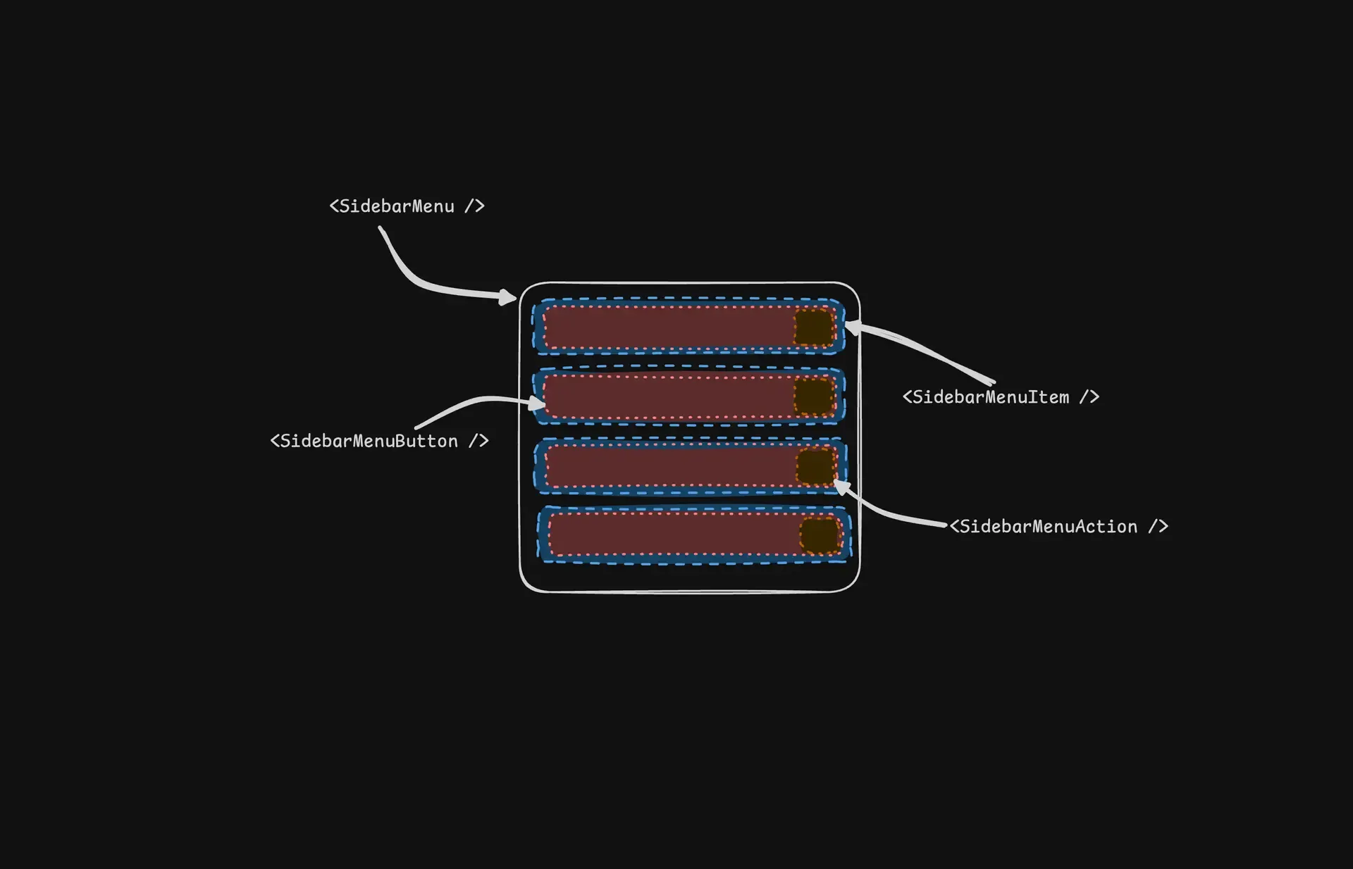
SidebarMenuButton은 SidebarMenuItem에서 렌더링 되는 컨텐츠와도 같다. 처음에 Button이라고 해서 작은 버튼인줄 알았는데 MenuItem에 렌더링 되는 전체가 버튼처럼 동작한다.
const sidebarMenuButtonVariants = cva(
'peer/menu-button flex w-full items-center gap-2 overflow-hidden rounded-md p-2 text-left text-sm outline-hidden ring-sidebar-ring transition-[width,height,padding] hover:bg-sidebar-accent hover:text-sidebar-accent-foreground focus-visible:ring-2 active:bg-sidebar-accent active:text-sidebar-accent-foreground disabled:pointer-events-none disabled:opacity-50 group-has-data-[sidebar=menu-action]/menu-item:pr-8 aria-disabled:pointer-events-none aria-disabled:opacity-50 data-[active=true]:bg-sidebar-accent data-[active=true]:font-medium data-[active=true]:text-sidebar-accent-foreground data-[state=open]:hover:bg-sidebar-accent data-[state=open]:hover:text-sidebar-accent-foreground group-data-[collapsible=icon]:size-8! group-data-[collapsible=icon]:p-2! [&>span:last-child]:truncate [&>svg]:size-4 [&>svg]:shrink-0',
{
variants: {
variant: {
default: 'hover:bg-sidebar-accent hover:text-sidebar-accent-foreground',
outline:
'bg-background shadow-[0_0_0_1px_hsl(var(--sidebar-border))] hover:bg-sidebar-accent hover:text-sidebar-accent-foreground hover:shadow-[0_0_0_1px_hsl(var(--sidebar-accent))]',
},
size: {
default: 'h-8 text-sm',
sm: 'h-7 text-xs',
lg: 'h-12 text-sm group-data-[collapsible=icon]:p-0!',
},
},
defaultVariants: {
variant: 'default',
size: 'default',
},
},
);
JavaScript
복사
cva를 통해 스타일링을 함수화 하여 사용한다. 이는 sidebarMenuButtonVariants({variant, size}) 형식으로 동작한다.
const Comp = asChild ? Slot : 'button';
const { isMobile, state } = useSidebar();
const button = (
<Comp
data-slot='sidebar-menu-button'
data-sidebar='menu-button'
data-size={size}
data-active={isActive}
className={cn(sidebarMenuButtonVariants({ variant, size }), className)}
{...props}
/>
);
if (!tooltip) {
return button;
}
TypeScript
복사
이 컴포넌트는 tooltip 여부를 판단하여 먼저 조건부 렌더링을 한다. tooltip이 없을 때에는 아래서 나올 tooltip 컴포넌트를 생성하지 않고 위에서 미리 만들어두었던 variants를 활용하여 스타일링을 한다.
if (typeof tooltip === 'string') {
tooltip = {
children: tooltip,
};
}
return (
<Tooltip>
<TooltipTrigger asChild>{button}</TooltipTrigger>
<TooltipContent
side='right'
align='center'
hidden={state !== 'collapsed' || isMobile}
{...tooltip}
/>
</Tooltip>
);
TypeScript
복사
만약 <SidebarMenuButton tooltip=’Tooltip’ /> 형식으로 tooltip이 string이라면 구조 통일을 위해 tooltip을 children에 넣고 객체화한다. 그리고 tooltip이 있으면 shadcn/ui의 Tooltip 컴포넌트와 그 하위 컴포넌트를 활용하여 위의 MenuItem(button)과 tooltip을 표시한다.
SidebarMenuAction
function SidebarMenuAction({
className,
asChild = false,
showOnHover = false,
...props
}: React.ComponentProps<'button'> & {
asChild?: boolean;
showOnHover?: boolean;
}) {
const Comp = asChild ? Slot : 'button';
return (
<Comp
data-slot='sidebar-menu-action'
data-sidebar='menu-action'
className={cn(
'text-sidebar-foreground ring-sidebar-ring hover:bg-sidebar-accent hover:text-sidebar-accent-foreground peer-hover/menu-button:text-sidebar-accent-foreground absolute top-1.5 right-1 flex aspect-square w-5 items-center justify-center rounded-md p-0 outline-hidden transition-transform focus-visible:ring-2 [&>svg]:size-4 [&>svg]:shrink-0',
// Increases the hit area of the button on mobile.
'after:absolute after:-inset-2 md:after:hidden',
'peer-data-[size=sm]/menu-button:top-1',
'peer-data-[size=default]/menu-button:top-1.5',
'peer-data-[size=lg]/menu-button:top-2.5',
'group-data-[collapsible=icon]:hidden',
showOnHover &&
'peer-data-[active=true]/menu-button:text-sidebar-accent-foreground group-focus-within/menu-item:opacity-100 group-hover/menu-item:opacity-100 data-[state=open]:opacity-100 md:opacity-0',
className,
)}
{...props}
/>
);
}
TypeScript
복사
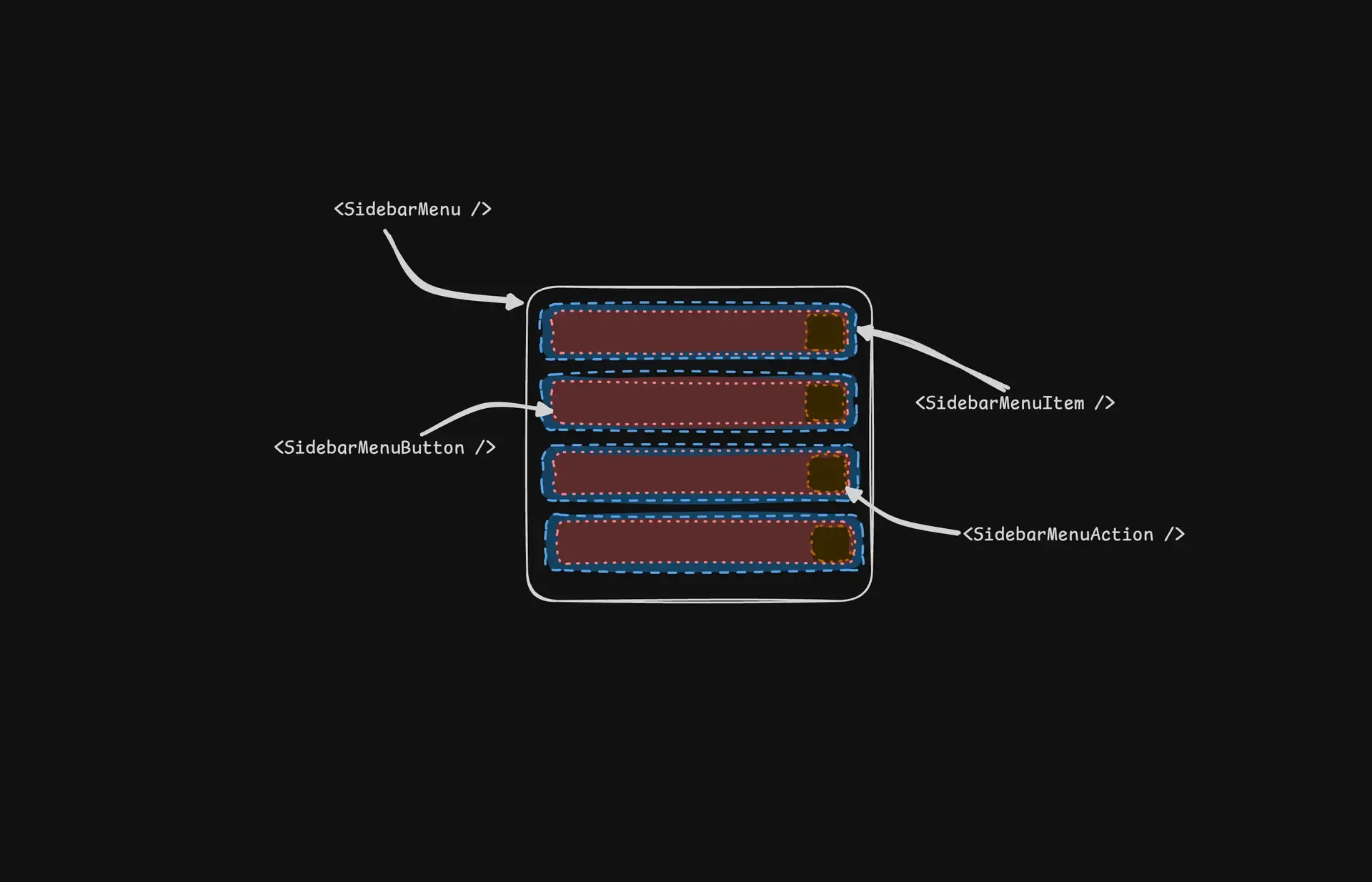
SidebarMenuAction은 SidebarMenuButton의 우측 끝에 붙는 작은 액션 버튼이다. MenuButton과 peer로 강하게 연동 되며 hover시 색상 동기화와 size에 따른 위치 자동 조정 등의 기능을 연결한다. menu-item과의 상태와도 연동 되며 메뉴 아이템과 일체감 있게 동작하는 액션 버튼이다.
SidebarMenuBadge
function SidebarMenuBadge({
className,
...props
}: React.ComponentProps<'div'>) {
return (
<div
data-slot='sidebar-menu-badge'
data-sidebar='menu-badge'
className={cn(
'text-sidebar-foreground pointer-events-none absolute right-1 flex h-5 min-w-5 items-center justify-center rounded-md px-1 text-xs font-medium tabular-nums select-none',
'peer-hover/menu-button:text-sidebar-accent-foreground peer-data-[active=true]/menu-button:text-sidebar-accent-foreground',
'peer-data-[size=sm]/menu-button:top-1',
'peer-data-[size=default]/menu-button:top-1.5',
'peer-data-[size=lg]/menu-button:top-2.5',
'group-data-[collapsible=icon]:hidden',
className,
)}
{...props}
/>
);
}
TypeScript
복사
SidebarMenuAction과 비슷하게 메뉴의 우측에 나타나는 컴포넌트이다. 하지만, 포인터 이벤트를 사용할 수 없고 숫자같은 단순히 데이터를 표시하는 용도로 사용 된다.
SidebarMenuSkeleton
function SidebarMenuSkeleton({
className,
showIcon = false,
...props
}: React.ComponentProps<'div'> & {
showIcon?: boolean;
}) {
// Random width between 50 to 90%.
const width = React.useMemo(() => {
return `${Math.floor(Math.random() * 40) + 50}%`;
}, []);
return (
<div
data-slot='sidebar-menu-skeleton'
data-sidebar='menu-skeleton'
className={cn('flex h-8 items-center gap-2 rounded-md px-2', className)}
{...props}
>
{showIcon && (
<Skeleton
className='size-4 rounded-md'
data-sidebar='menu-skeleton-icon'
/>
)}
<Skeleton
className='h-4 max-w-(--skeleton-width) flex-1'
data-sidebar='menu-skeleton-text'
style={
{
'--skeleton-width': width,
} as React.CSSProperties
}
/>
</div>
);
}
TypeScript
복사
사이드바에서 로딩과 같은 컨텍스트 발생 시 보여주는 컴포넌트이다. width를 활용하여 컨텐츠의 길이를 랜덤 길이로 보여준다. 왜냐하면 컨텐츠가 모두 같은 길이가 아니기 때문이다. showIcon을 true로 설정하면 좌측에 동그란 스켈레톤이 추가 된다.
SidebarMenuSub & SidebarMenuSubItem
function SidebarMenuSub({ className, ...props }: React.ComponentProps<'ul'>) {
return (
<ul
data-slot='sidebar-menu-sub'
data-sidebar='menu-sub'
className={cn(
'border-sidebar-border mx-3.5 flex min-w-0 translate-x-px flex-col gap-1 border-l px-2.5 py-0.5',
'group-data-[collapsible=icon]:hidden',
className,
)}
{...props}
/>
);
}
function SidebarMenuSubItem({
className,
...props
}: React.ComponentProps<'li'>) {
return (
<li
data-slot='sidebar-menu-sub-item'
data-sidebar='menu-sub-item'
className={cn('group/menu-sub-item relative', className)}
{...props}
/>
);
}
TypeScript
복사
Sidebar Submenu를 표시하는 컴포넌트이다. SidebarMenuSub는 서브 메뉴를 감싸는 ul 태그이고, SidebarMenuSubItem은 SidebarMenuSub 안에 렌더링 되는 아이템들이다.
SidebarMenuSubButton
function SidebarMenuSubButton({
asChild = false,
size = 'md',
isActive = false,
className,
...props
}: React.ComponentProps<'a'> & {
asChild?: boolean;
size?: 'sm' | 'md';
isActive?: boolean;
}) {
const Comp = asChild ? Slot : 'a';
return (
<Comp
data-slot='sidebar-menu-sub-button'
data-sidebar='menu-sub-button'
data-size={size}
data-active={isActive}
className={cn(
'text-sidebar-foreground ring-sidebar-ring hover:bg-sidebar-accent hover:text-sidebar-accent-foreground active:bg-sidebar-accent active:text-sidebar-accent-foreground [&>svg]:text-sidebar-accent-foreground flex h-7 min-w-0 -translate-x-px items-center gap-2 overflow-hidden rounded-md px-2 outline-hidden focus-visible:ring-2 disabled:pointer-events-none disabled:opacity-50 aria-disabled:pointer-events-none aria-disabled:opacity-50 [&>span:last-child]:truncate [&>svg]:size-4 [&>svg]:shrink-0',
'data-[active=true]:bg-sidebar-accent data-[active=true]:text-sidebar-accent-foreground',
size === 'sm' && 'text-xs',
size === 'md' && 'text-sm',
'group-data-[collapsible=icon]:hidden',
className,
)}
{...props}
/>
);
}
TypeScript
복사
SidebarMenuButton과 마찬가지로 SidebarMenuSubItem 안에 렌더링 되는 컨텐츠이다.asChild 파라미터가 true이면 child에 스타일과 동작만을 제공할 수 있다.